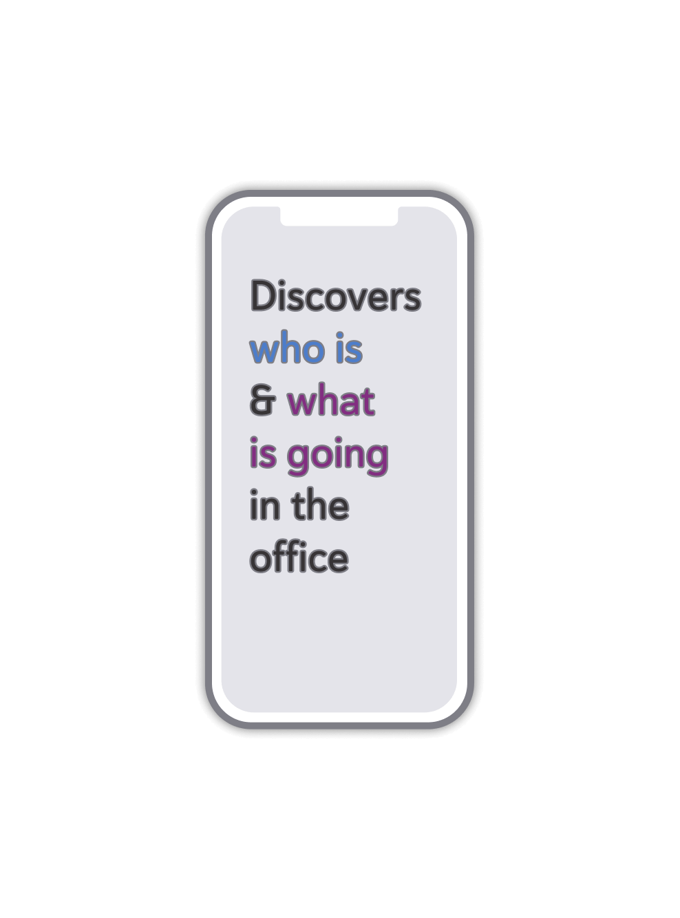
The discovery phase started with the user interview. I investigated our potential users, first of all, employees, in order to gather insights that will inform the design process. The main question I was interested in:
how do employees go to the office in hybrid mode?
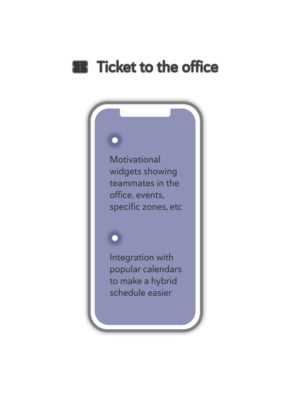
The interview script was broken down into 4 blocks: 1. Motivation, 2. Planning habits, 3. Being in the office, 4. Previous experience with booking apps. The blocks contained questions, clarifying questions (optional), and card activities. The card activities were: 1. “What motivates most to go to the office”, 2. “Imagine you’re planning your visit...”, and 3. Key criteria for choosing a desk. I managed to interview 29 respondents, among whom were 11 men and 18 women, 9 team leaders, 5 newcomers, and mainly from big-scale tech & product companies varying from 700 to 3,500 employees.

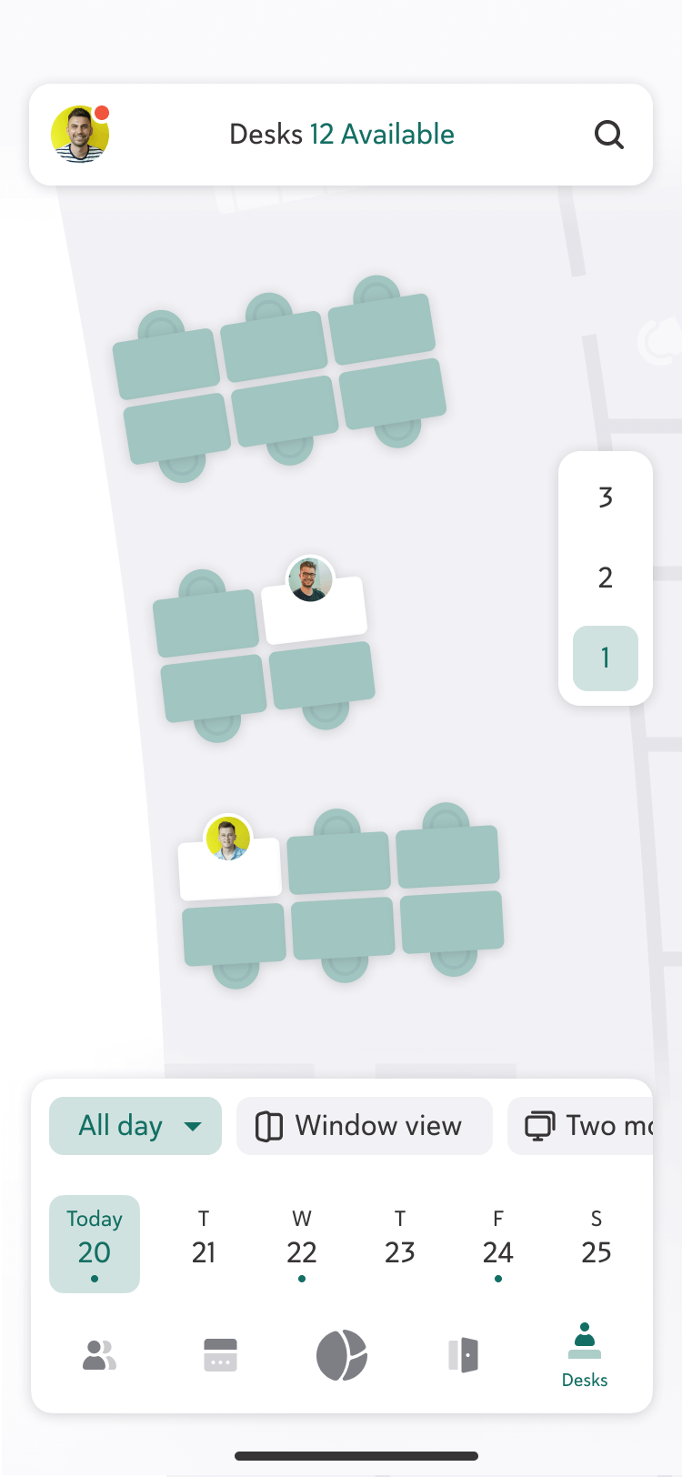
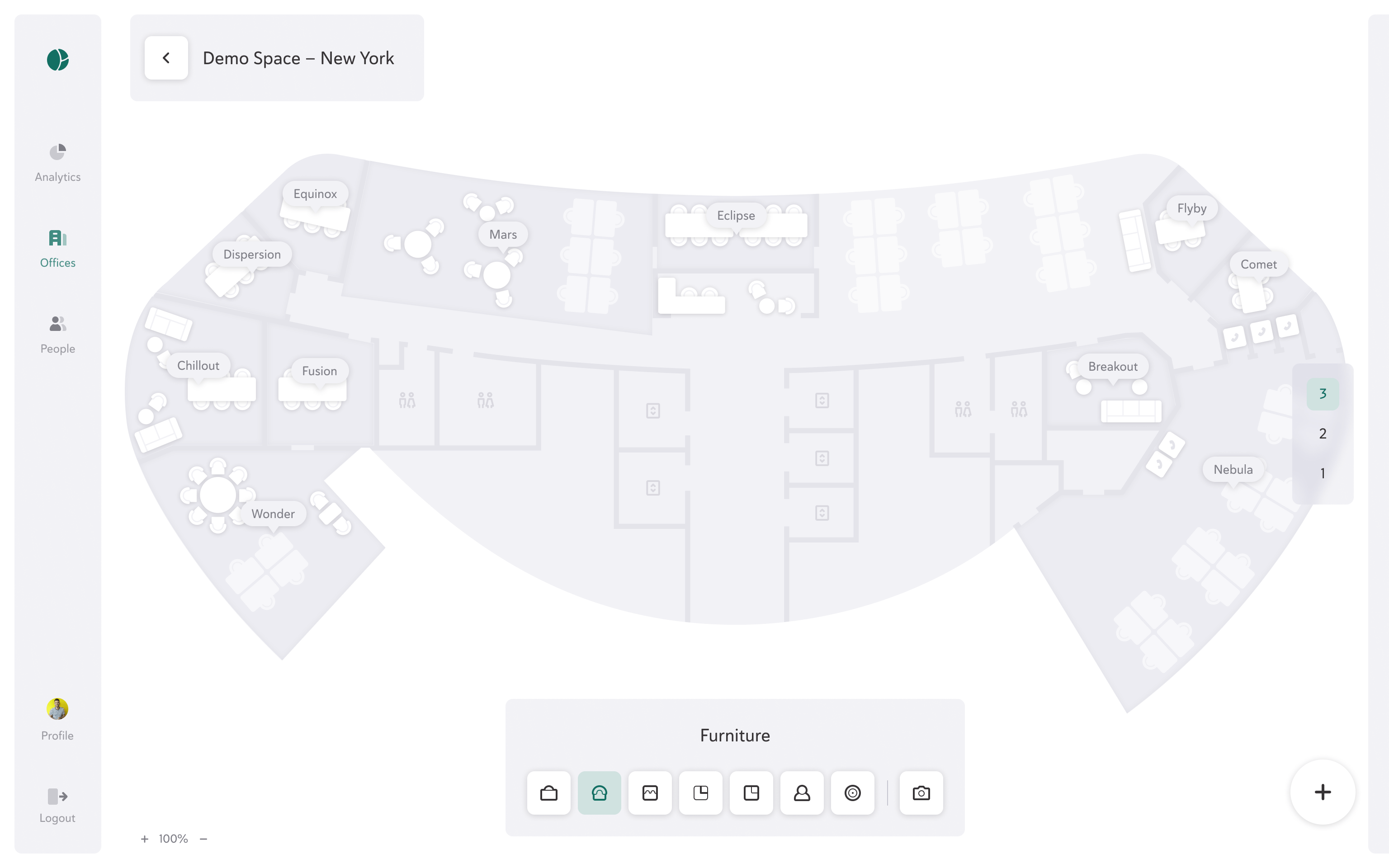
 Context
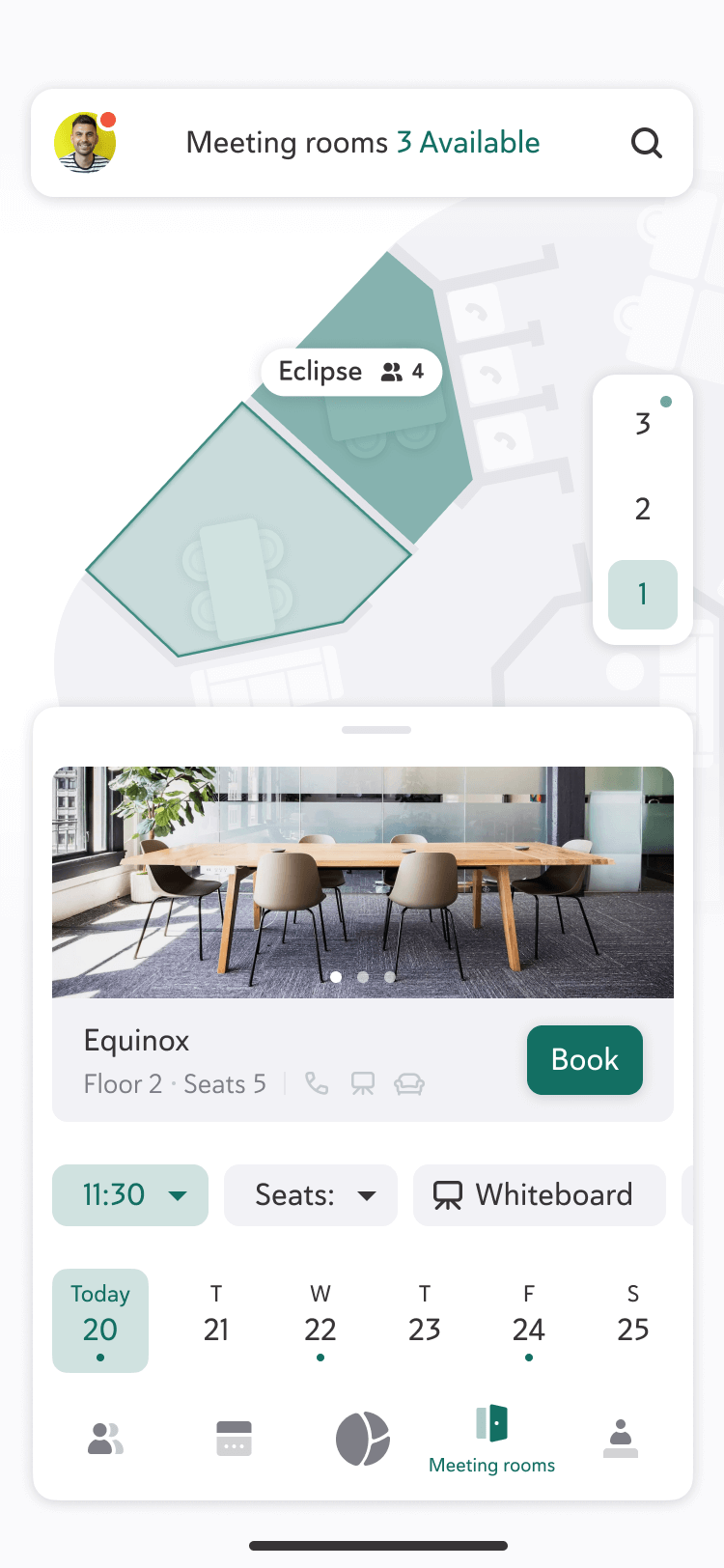
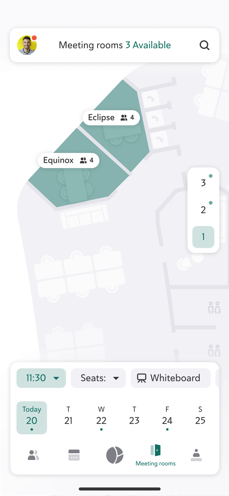
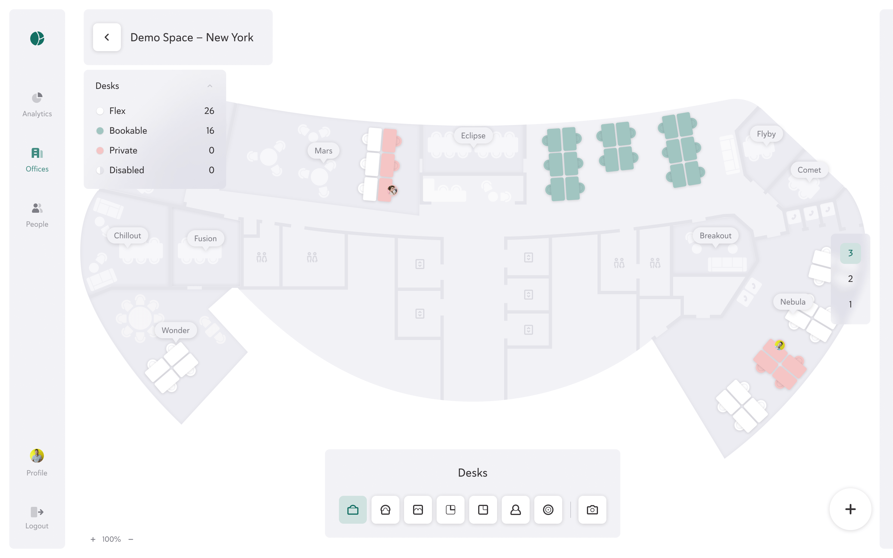
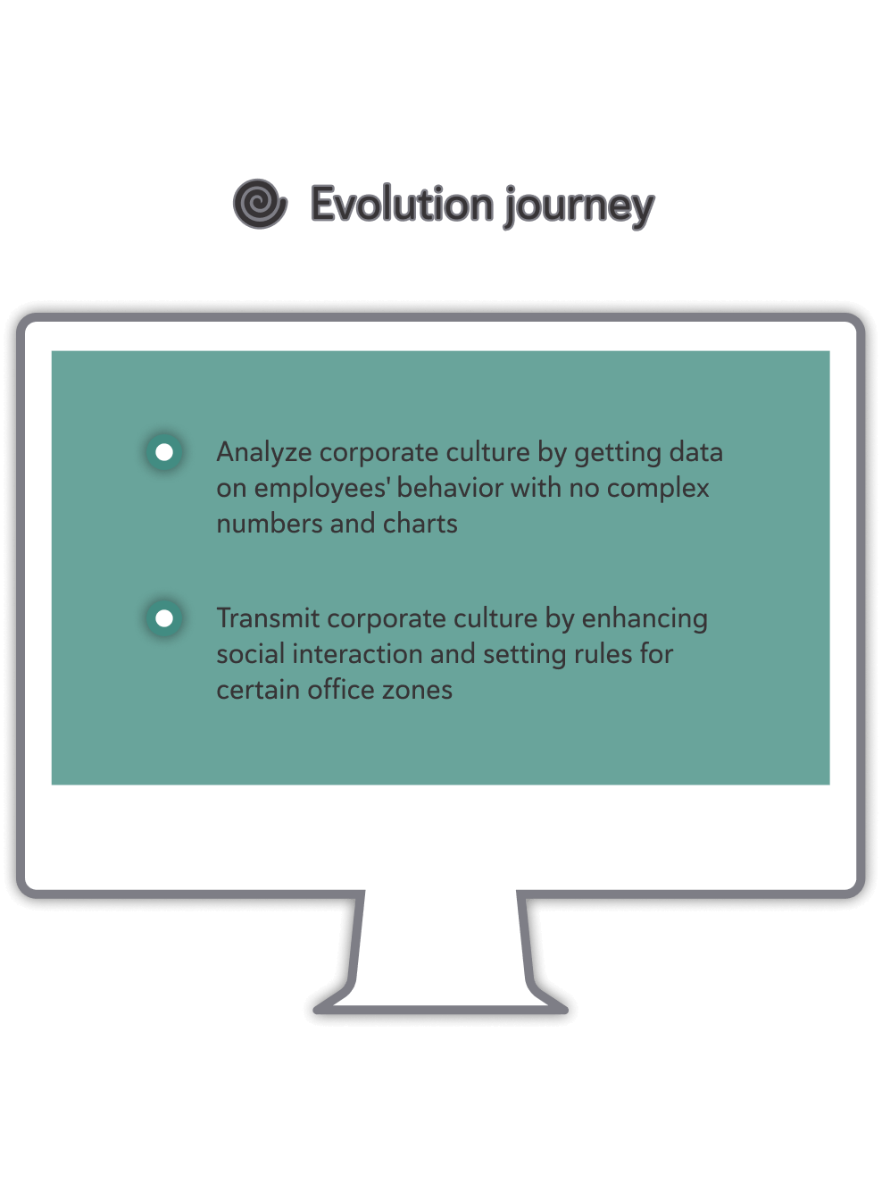


 Go to top